User Experience
- PROJECT
- Client: Explore Texas
- Type: Travel & Tourism
- TOOLS
- Figma
- FigJam
challenge
Explore Texas needed a clear sense of how people would actually move through the site, and whether the experience would feel simple rather than cluttered, before any real design work began. Rather than assuming a structure would work, the goal was to validate the user journey directly: what would make the site easy to use without stripping out the functionality that made it genuinely useful.
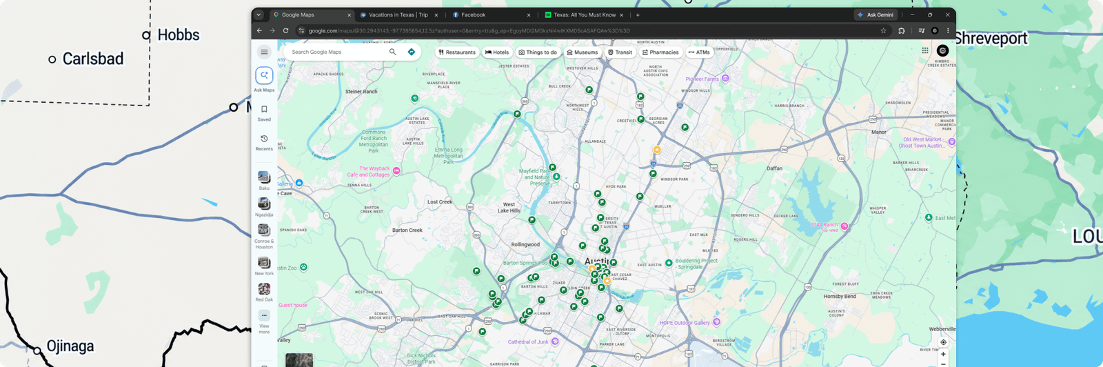
process
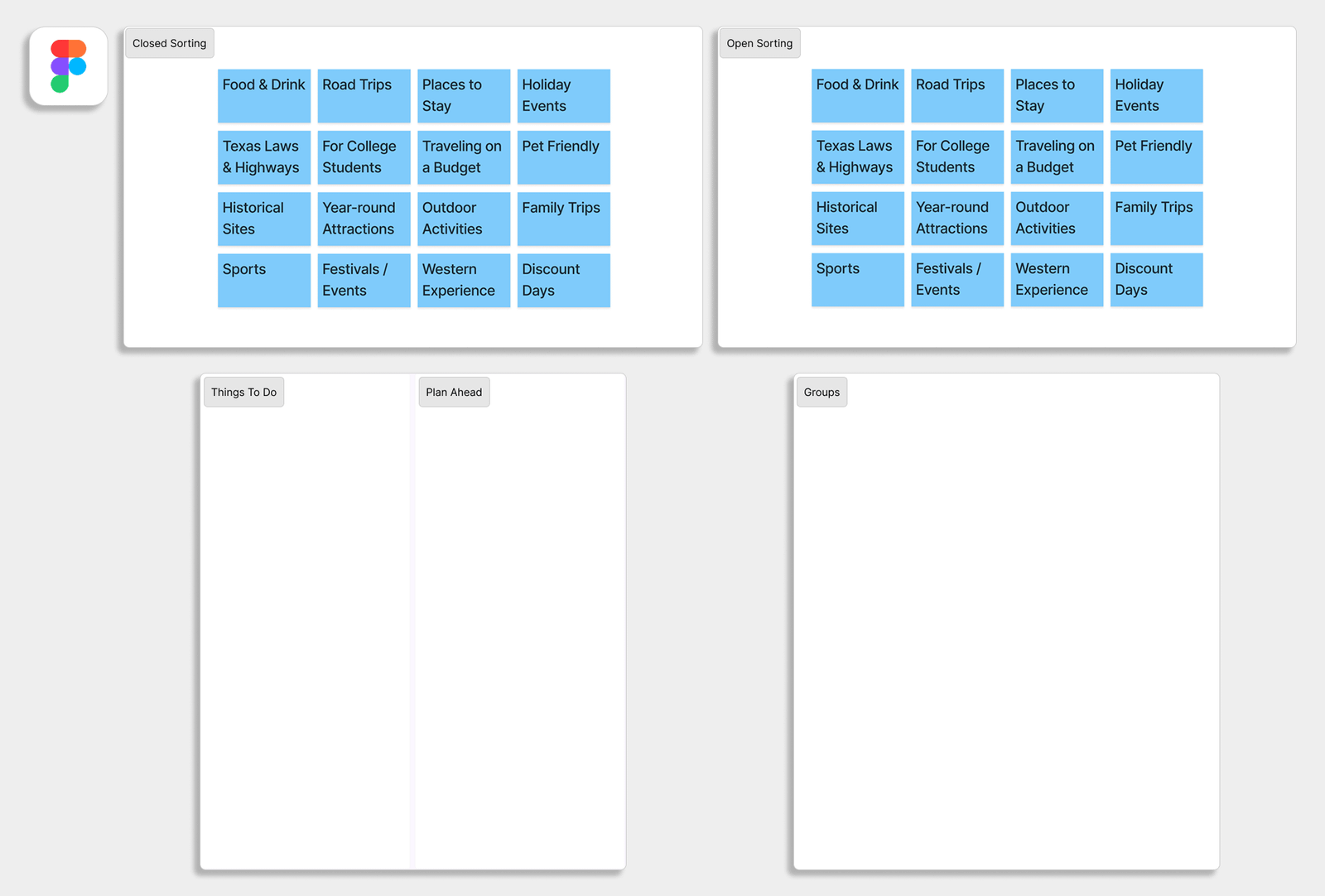
Research started with questionnaires to understand who the target users were and what they needed from the platform, followed by a competitive analysis to see how similar sites approached the same balance of simplicity and utility. From there, both open and closed card sorting rounds revealed how users naturally expected to find and group information: open sorting surfaced their own mental categories first, and closed sorting then tested those categories against the structure being considered.
The clearest signal came from how consistently users grouped content in ways that didn't match the original assumptions about site structure. That finding reshaped the information architecture before any prototyping began, keeping the eventual UI from becoming bloated with navigation people wouldn't have understood.
solution
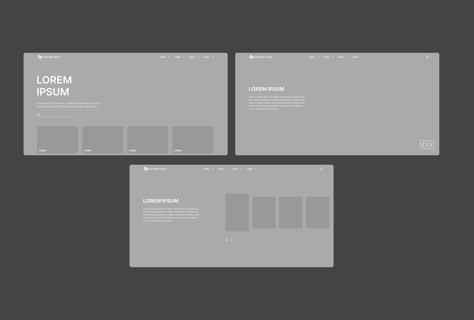
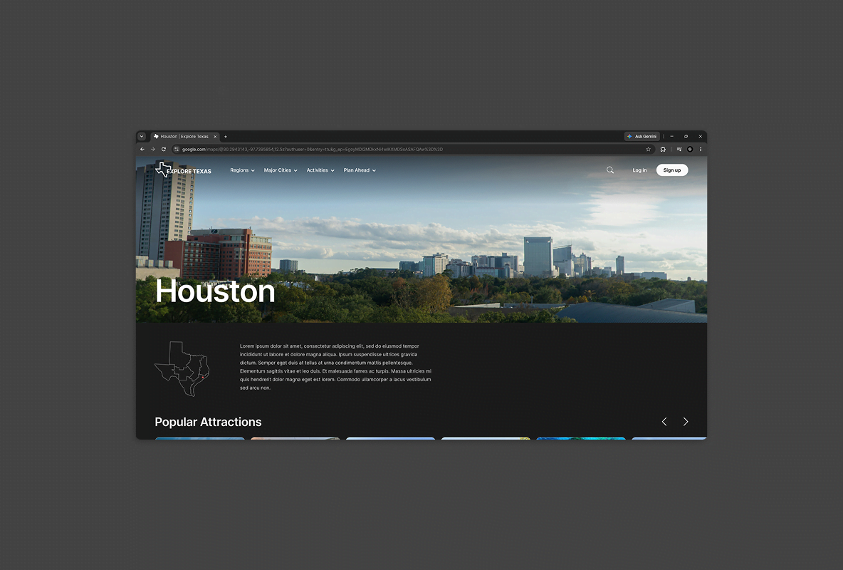
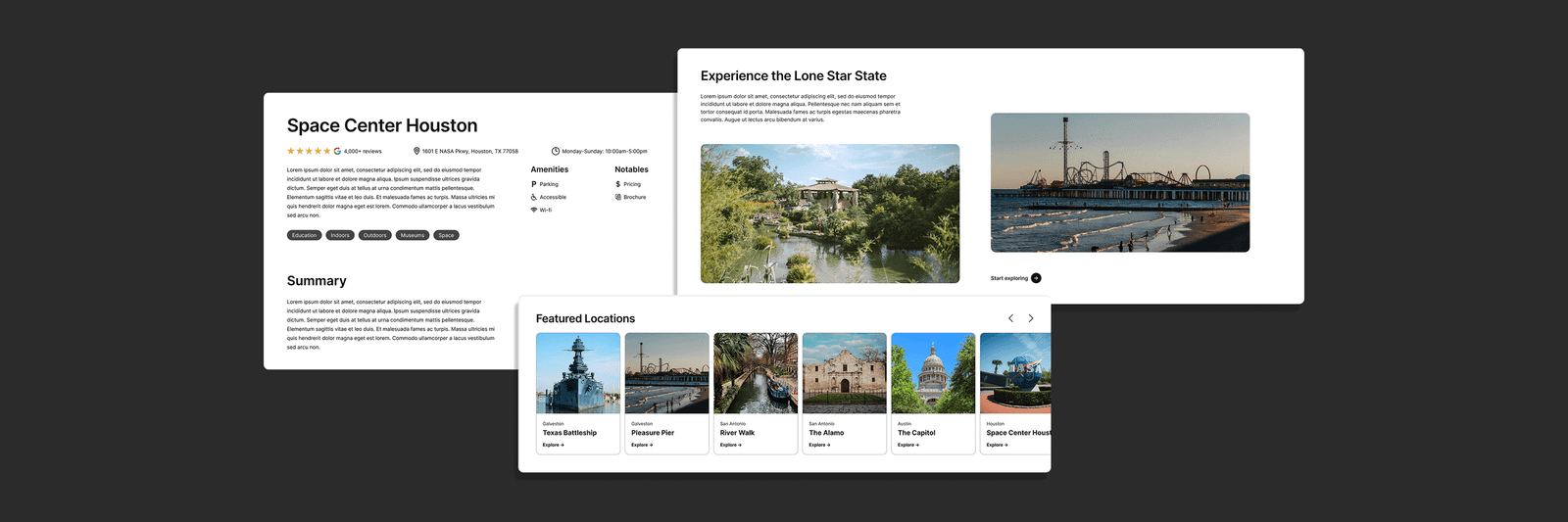
The research directly shaped a set of prototype pages built around the user journey people actually expected, balancing ease of use with the functionality the site needed to deliver.
outcome
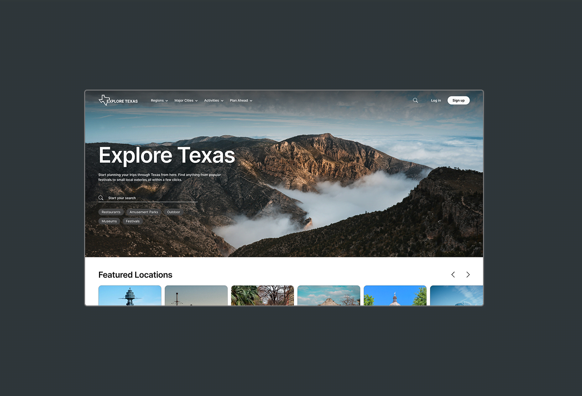
The design moved into active development, and Cesar remains the person brought in whenever the software's scope changes and the design needs updating.